01
Sequence
Turn dense product information into steps a reader can follow.

Juspay / Complete global rebrand
From an India-rooted payments company to a global payments brand.
After more than a decade building in one of the world’s most complex payment markets, Juspay was becoming a global company.
The rebrand gave that change a clear position, a useful message and a system capable of carrying many local payment realities.
The global promise was not sameness. It was a shared operating layer fluent in the methods, rails and decisions of each market.
Juspay had spent years learning from the density of Indian payments. Going global was a chance to turn that hard-won intelligence into a clearer position for the world.
I led the complete rebrand across positioning, messaging, identity, website, art direction and creative direction. The job was to make Juspay’s global ambition credible.
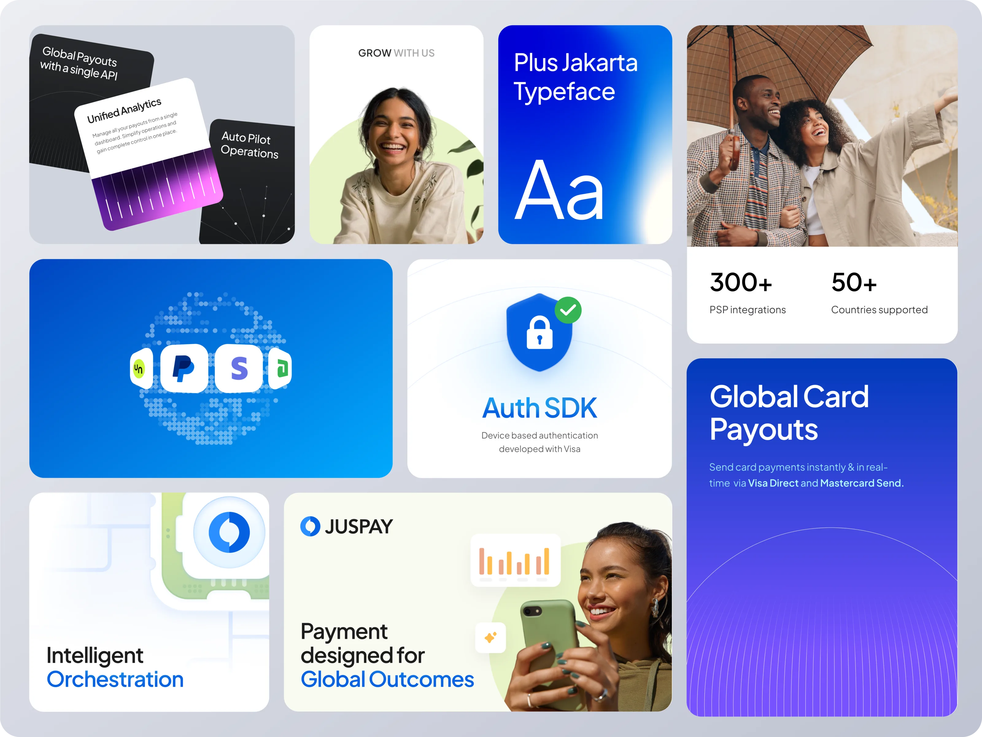
A merchant sees conversion. A bank sees risk. A developer sees integrations. A payments team sees routes, costs and failure states.
Methods, providers, rules and priorities change by market. Recognition had to come from a stable grammar—not a repeated picture.
Turn dense product information into steps a reader can follow.

Use concentrated colour for state, action and priority.

Show routing, handoffs and change over time.

Keep hierarchy stable when the composition has less room.
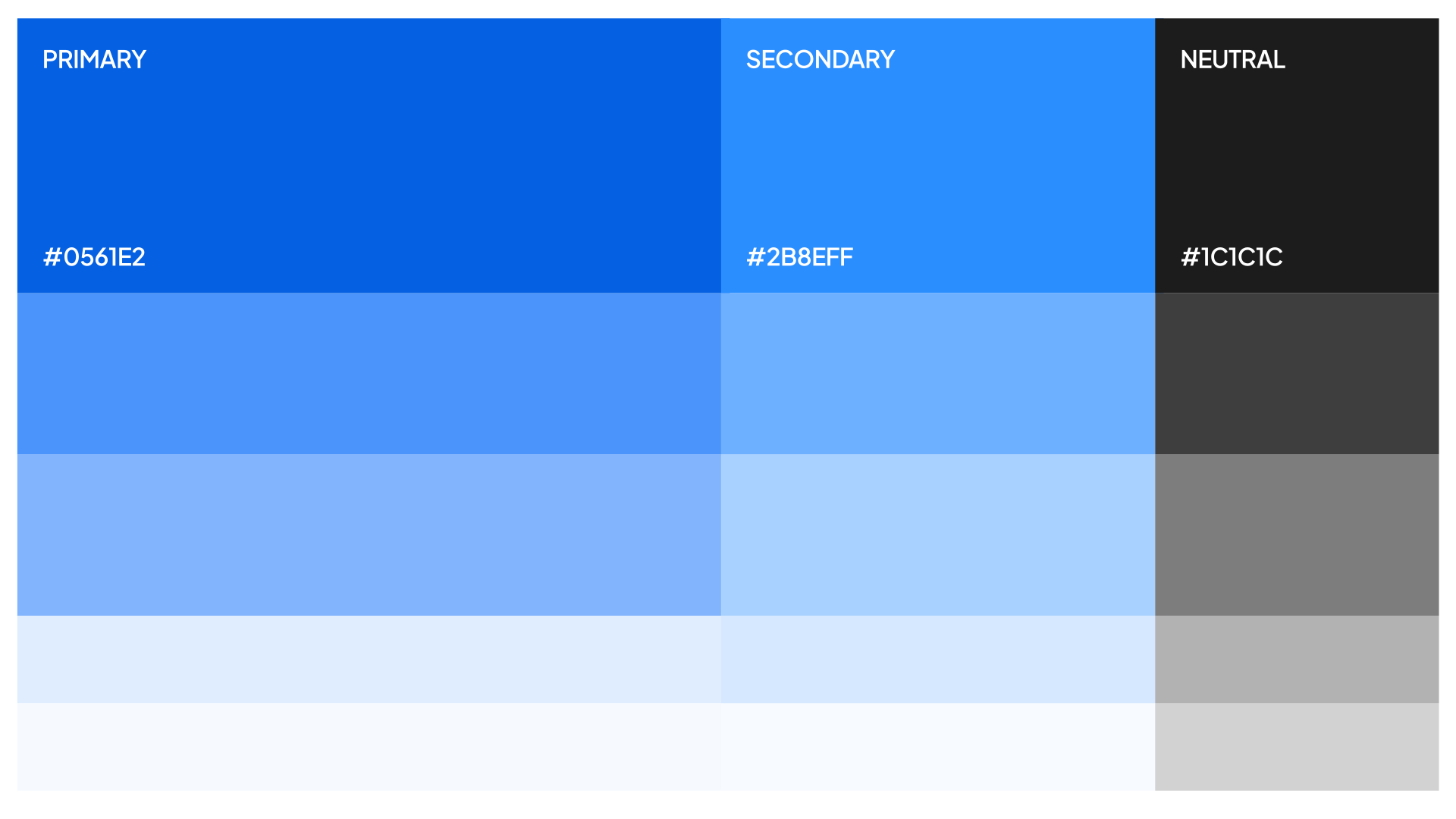
Diatype, exacting grids and a high-contrast information hierarchy gave the case study its voice. Blue established the brand; green, teal and purple acted as signals.
The result could move from authentication to offers, infrastructure to regional expression—without becoming another company.
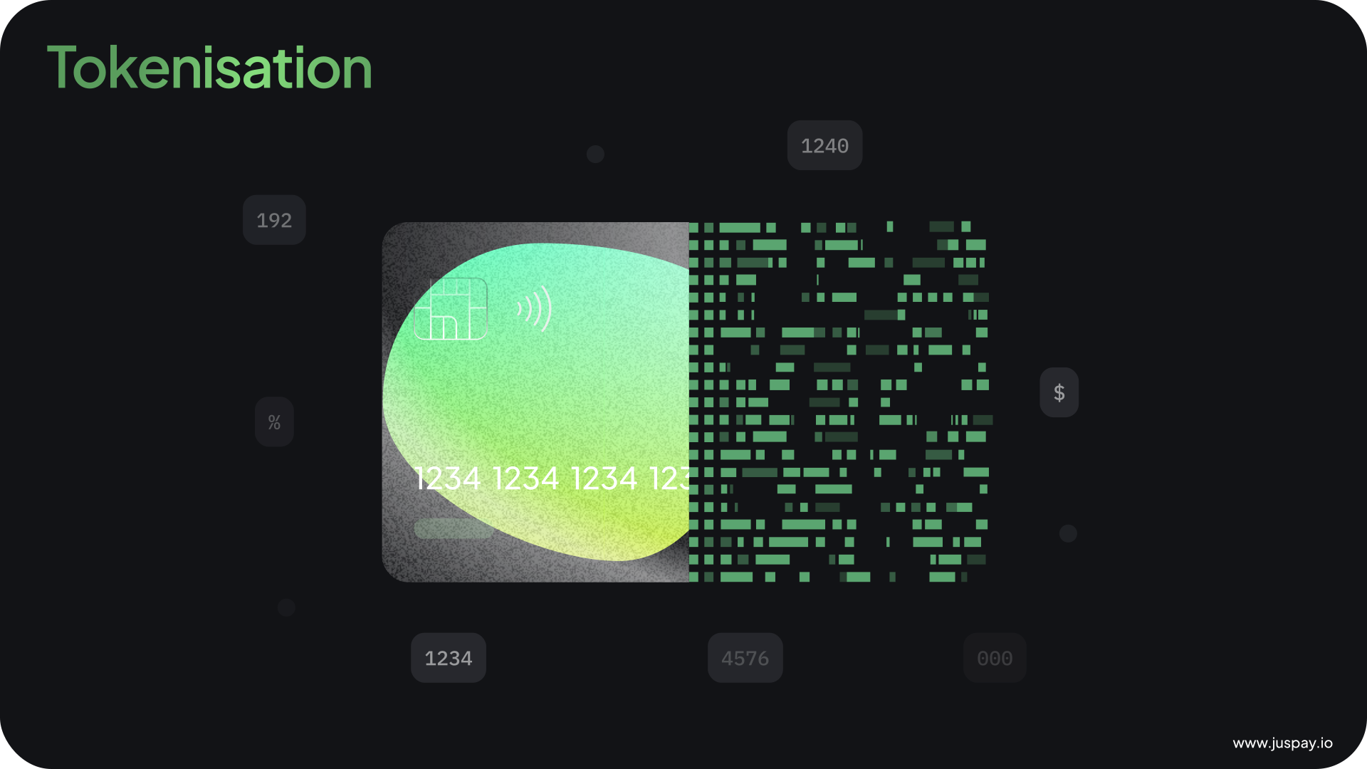
Authentication, acceptance and tokenisation each carry a different job. A minimal field lets the animation explain the difference.
Network tokens turn technical infrastructure into a story about trust, efficiency and commercial consequence.
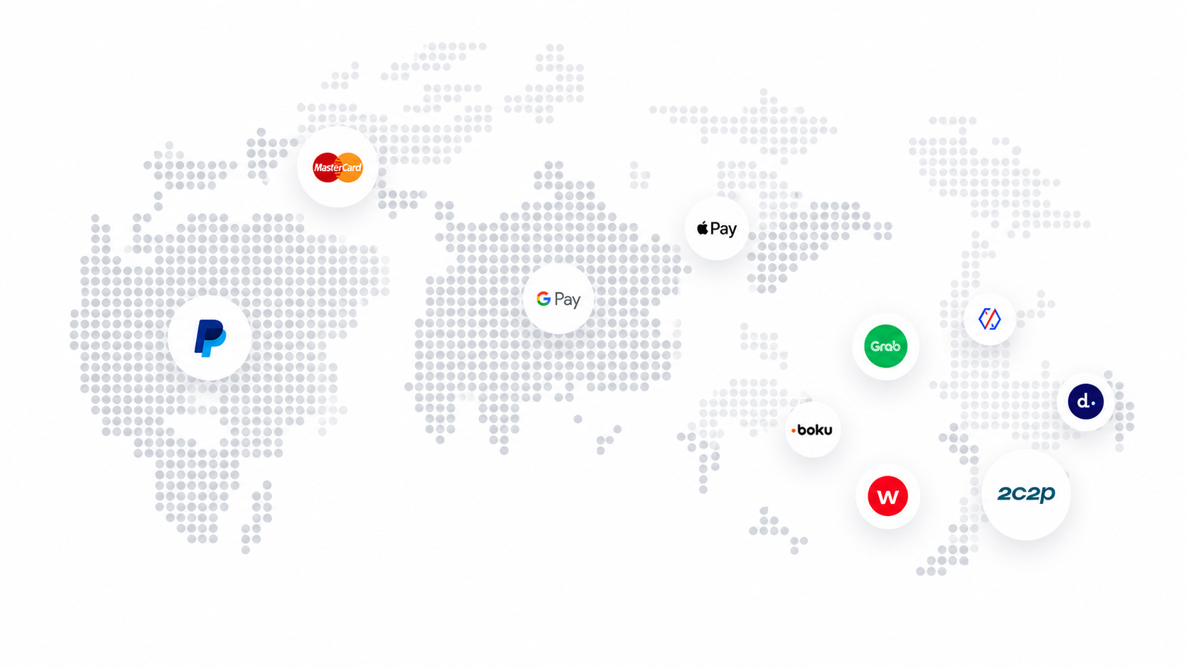
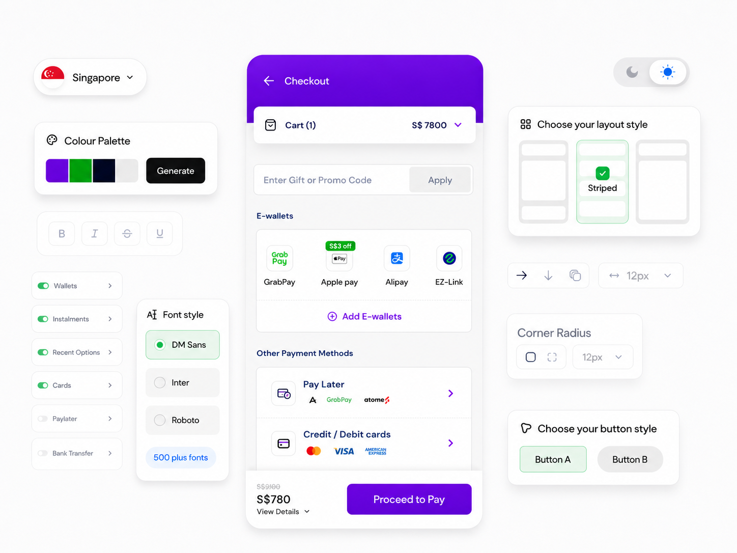
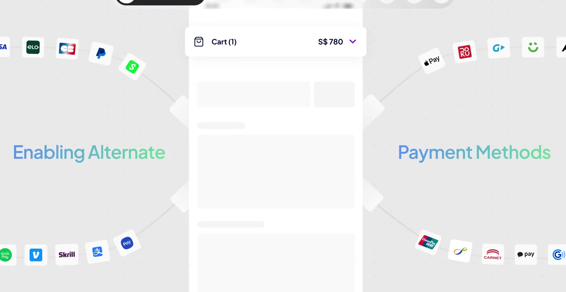
Every country brings its own methods, rails, regulation, risk and habits. The system travelled by knowing what had to stay stable—and what had to change.
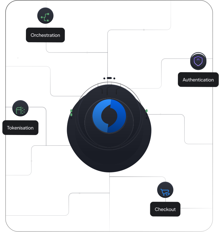
Transactions, providers and outcomes are brought into one coordinated view.
One stable system, expressed through different payment conditions. Each product keeps its specialist logic while the shared grammar keeps the company legible.
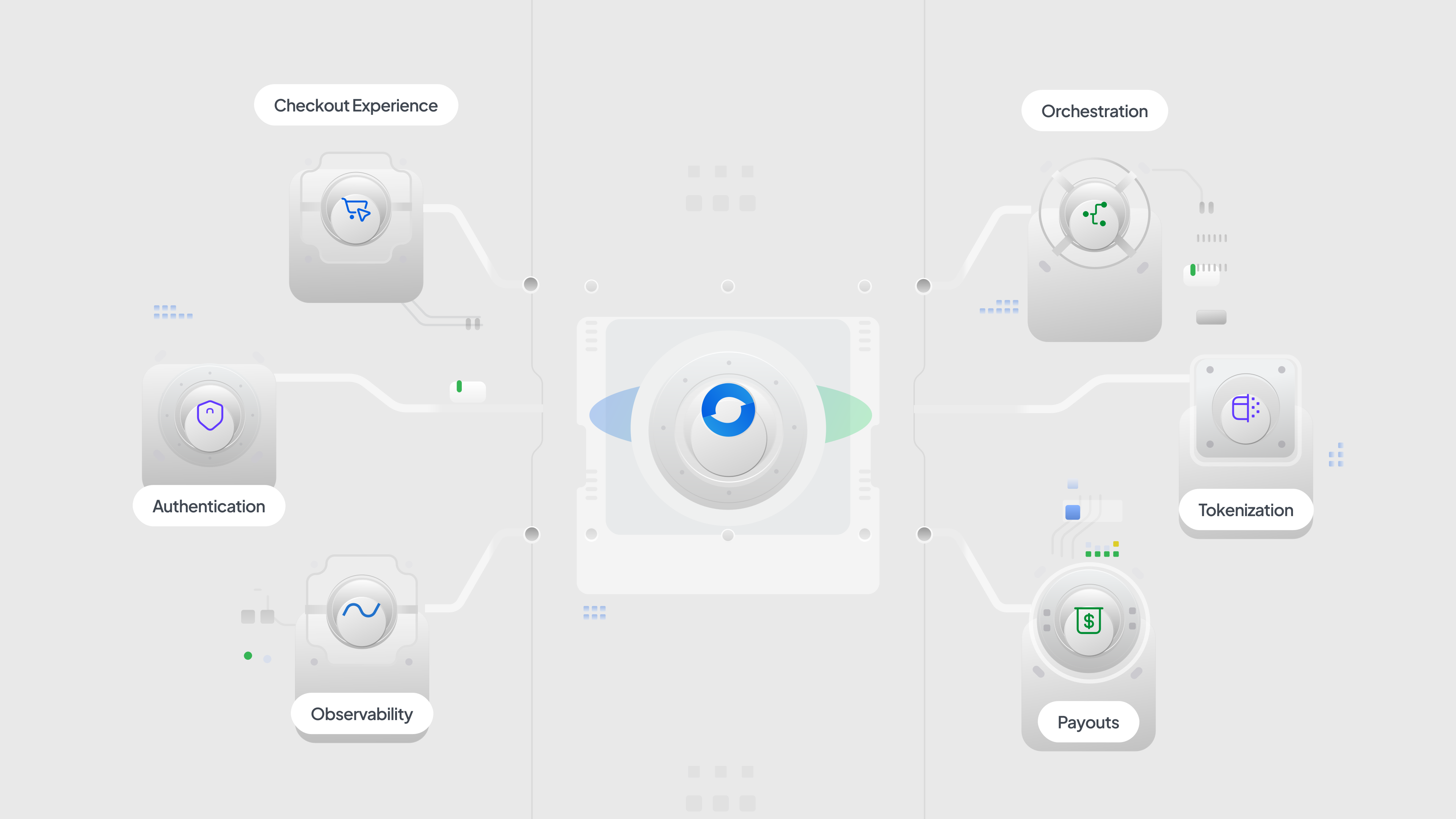
My remit covered positioning, messaging, brand, art and creative direction, website direction and system stewardship.
It was team-built. Designers, motion designers, illustrators, developers and production partners carried distinct parts of the system.
 Built in India. Ready for the world.
A global brand built to carry local payment reality.